Binscatter: A New Visual Tool for Data Analysis
Background
In the realm of data visualization, the classical scatter plot has long been a staple for exploring bivariate relationships. However, as datasets grow larger and more complex, traditional scatter plots can become cluttered and less informative. Privacy concerns may also limit the ability to plot raw data, and simple bivariate plots often fail to reveal causal relationships. This is where binscatter, or binned scatter plots, come into play.
Binscatter offers a cleaner, more interpretable way to visualize the relationship between two variables, especially when dealing with large datasets. By aggregating data points into bins and plotting the average outcome within each bin, binscatter simplifies the visualization, making it easier to discern patterns and trends. It’s particularly useful for:
- Intuitive visualization for large datasets by grouping data into bins.
- Highlighting trends and relationships between variables effectively.
- Extending these ideas to control for covariates.
In this article, I will introduce binscatter, explore its mathematical foundation, and demonstrate its utility with an example in R and python.
Notation
To formalize binscatter, let’s define the following:
- \(X\): The independent/predictor variable.
- \(Y\): The dependent/outcome/response variable.
- \(n\): The number of observations in the dataset.
- \(K\): The number of bins into which \(X\) is divided.
- \(\bar{Y}_k\): The mean of \(Y\) for observations falling in the \(k\)-th bin of \(X\). Similarly for \(\bar{X}_k\).
- \(B_k\): The observations falling in the \(k\)-th bin.
- \(W\): The covariate to be controlled. This can be a vector too.
A Closer Look
Formal Definition
A binscatter plot is constructed by partitioning the range of the independent variable \(X\) into a fixed number of \(K\) bins, \(B_1,\dots,B_K\) typically using empirical quantiles. This ensures each bin is of roughly the same size. Within each bin, the average value of the dependent variable \(Y\) is calculated. These averages are then plotted against the midpoint of each bin, \(\bar{X}\), resulting in a series of points that represent an estimate of the conditional mean of \(Y\) given \(X\), \(E[Y\mid X]\).
In technical jargon, binscatter provides a nonparametric estimate of the conditional mean function, offering a visual summary of the relationship between the two variables. The resulting graph allows assessment of linearity, monotonicity, convexity, etc.
The Algorithm
Here is the step-by-step recipe for constructing a binscatter plot.
Bin construction: Divide the range of \(X\) into \(K\) equal-width bins, or use quantile-based bins for equal sample sizes within bins. For example, with \(K=10\), the observations in \(B_1\) would be those between the minimum value of \(X\) and that of its tenth percentile.
Mean calculation: Compute the mean of \(Y\) within each bin:
\[\bar{Y}_k= \frac{1}{|B_k|} \sum_{i \in B_k} Y_i,\]
where \(|B_k|\) is the number of observations in bin \(B_k\).
- Plotting: Plot \(\bar{Y}_k\) against the midpoints of each bin, \(\bar{X}_k\).
Software Package: binsreg.
Quite simple, right? Let’s explore certain useful extensions of this idea.
Adjusting for Covariates: The Wrong Way
In many applications, it is essential to control for additional covariates \(W\) to isolate the relationship between the primary variables of interest. The object of interest then becomes the conditional mean \(E[Y\mid W,X]\). An example would be focusing on the relationship between income (\(Y\)) and education level (\(X\)) when controlling for parental education (\(W\)).
A common but flawed approach to incorporating covariates in binscatter is residualized binscatter. This method involves first regressing separately both \(Y\) and \(X\) on the covariates \(W\) to obtain residuals \(\hat{u}_Y\) and \(\hat{u}_X\), and then applying the binscatter method to these residuals:
\[\bar{\hat{u}}_{Y,k} = \frac{1}{|B_k|} \sum_{i \in B_k} \hat{u}_{Y,i}.\]
While this approach is motivated by the Frisch-Waugh-Lovell theorem in linear regression, it can lead to incorrect conclusions in more general settings. The residualized binscatter may not accurately reflect the true conditional mean function, especially if the underlying relationship is nonlinear. Therefore, it is generally not recommended for empirical work.
Adjusting for Covariates: The Right Way
Instead, this should be done using a semi-parametric partially linear regression model. This is achieved by modeling the conditional mean function as
\[Y = \mu_0(X) + W \gamma_0 + \varepsilon,\]
where \(\mu_0(X)\) captures the main effect of \(X\), and \(W' \gamma_0\) adjusts for the influence of additional covariates. Rather than residualizing, we estimate \(\mu_0(X)\) using the least-squares approach:
\[(\hat{\beta}, \hat{\gamma}) = \arg\min_{\beta, \gamma} \sum (Y- b(X)' \beta - W' \gamma)^2,\]
where \(b(X)\) represents the binning basis functions. The final binscatter plot displays the estimated conditional mean function
\[\hat{\mu}(X_k) = b(X_k)' \hat{\beta}\]
against \(\bar{X}_k\), ensuring a correct visualization of the relationship between \(X\) and \(Y\) after accounting for the covariates \(W\).
Practical Considerations
A key decision is the choice of the number of bins \(K\). Too few bins can oversmooth the data, masking important features, while too many bins can lead to undersmoothing, resulting in a noisy and less interpretable plot. An optimal choice of \(K\) balances bias and variance, often determined using data-driven methods. To address this, Cattaneo et al. (2024) propose an adaptive, Integrated Mean Squared Error (IMSE)-optimal choice of \(K\) for which they derive a plug-in formula.
Thoughtful data scientists always have variance in their mind. If, for instance, we see some linear relationship between \(Y\) and \(X\), how can we determine whether it is statistically significant? Quantifying the uncertainty around binscatter estimates is crucial. The authors also discuss constructing confidence bands, which can be added to the plot to visually represent estimation uncertainty, enhancing both interpretability and reliability.
An Example
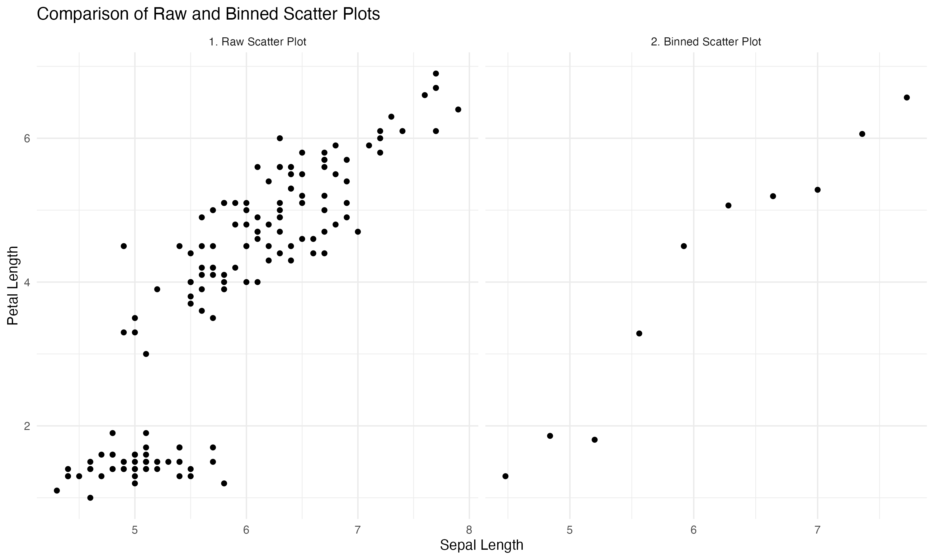
As an example let’s examine the relationship between the variables Sepal.Length and Petal.Length in the popular iris dataset. We will use a fixed number of ten bins. Alternatively, the package binsreg will automatically calculate the optimal \(K\).
# clear the workspace and load libraries
rm(list=ls())
library(ggplot2)
library(dplyr)
library(binsreg)
data(iris)

# define the number of bins
bins <- 10

# create binned data
iris_binned <- iris %>%
  mutate(bin = cut(Sepal.Length, breaks = bins, include.lowest = TRUE)) %>%
  group_by(bin) %>%
  summarize(
    bin_mid = mean(as.numeric(as.character(bin))),
    mean_petal_length = mean(Petal.Length)
  )

# Add a panel label for the raw scatter plot
iris_raw <- iris %>%
    mutate(panel = "1. Raw Scatter Plot")

# Add a panel label for the binned scatter plot
iris_binned <- iris_binned %>%
  mutate(panel = "2. Binned Scatter Plot")

# Combine raw and binned data into a single dataset for plotting
plot_data <- bind_rows(
iris_raw %>% rename(x = Sepal.Length, y = Petal.Length),
  iris_binned %>% rename(x = bin_mid, y = mean_petal_length)
)

# Create the plot
ggplot(plot_data, aes(x = x, y = y)) +
  geom_point() +
  facet_wrap(~ panel, scales = "free_x", ncol = 2) +
  labs(title = "Comparison of Raw and Binned Scatter Plots",
  x = "Sepal Length",
  y = "Petal Length") +
  theme_minimal()
import pandas as pd
import numpy as np
import matplotlib.pyplot as plt
import seaborn as sns
# Load the iris dataset
from sklearn.datasets import load_iris
iris_data = load_iris(as_frame=True)
iris = iris_data['data']
iris.columns = ['Sepal.Length', 'Sepal.Width', 'Petal.Length', 'Petal.Width']
# Number of bins
bins = 10
# Create binned data
iris['bin'] = pd.cut(iris['Sepal.Length'], bins=bins, include_lowest=True)
iris_binned = iris.groupby('bin').agg(
bin_mid=('Sepal.Length', lambda x: (x.min() + x.max()) / 2),
mean_petal_length=('Petal.Length', 'mean')
).reset_index()
# Add panel labels
iris_raw = iris[['Sepal.Length', 'Petal.Length']].copy()
iris_raw['panel'] = "1. Raw Scatter Plot"
iris_binned = iris_binned.rename(columns={'bin_mid': 'Sepal.Length', 'mean_petal_length': 'Petal.Length'})
iris_binned['panel'] = "2. Binned Scatter Plot"
# Combine raw and binned data
plot_data = pd.concat([iris_raw, iris_binned], ignore_index=True)
# Plot
sns.set_theme(style="whitegrid")
fig, axes = plt.subplots(1, 2, figsize=(12, 6), sharey=True)
# Raw scatter plot
sns.scatterplot(
data=plot_data[plot_data['panel'] == "1. Raw Scatter Plot"],
x='Sepal.Length', y='Petal.Length', ax=axes[0]
)
axes[0].set_title("1. Raw Scatter Plot")
axes[0].set_xlabel("Sepal Length")
axes[0].set_ylabel("Petal Length")
# Binned scatter plot
sns.scatterplot(
data=plot_data[plot_data['panel'] == "2. Binned Scatter Plot"],
x='Sepal.Length', y='Petal.Length', ax=axes[1]
)
axes[1].set_title("2. Binned Scatter Plot")
axes[1].set_xlabel("Sepal Length")
# Adjust layout
plt.suptitle("Comparison of Raw and Binned Scatter Plots")
plt.tight_layout()
plt.show()Here is the resulting image. The left scatter plot displays the raw data and the right one shows the binscatter. Binscatter removes some of the clutter and highlights the linear relationship more directly.
Bottom Line
Binscatter simplifies scatterplots by aggregating data into bins and plotting means.
It is a powerful tool for visualizing relationships in large or noisy datasets.
Conditional and residualized binscatter extend its utility to controlling for covariates.
While intuitive, binscatter is sensitive to binning choices and may obscure nuances.
Where to Learn More
Both papers cited below are relatively accessible and will answer your questions. Start with Starr and Goldfarb (2020).
References
Cattaneo, M. D., Crump, R. K., Farrell, M. H., & Feng, Y. (2024). On Binscatter Regressions. American Economic Review, 111(3), 718–748.
Starr, E., & Goldfarb, B. (2020). Binned scatterplots: A simple tool to make research easier and better. Strategic Management Journal, 41(12), 2261-2274.